- Read Tutorial
- Watch Guide Video
- Complete the Exercise
Now, this looks quite a bit different because it doesn't have any other responsive elements yet. The very first step that we need to take is to open up that about.html file, and import our media queries. I'm going to pull this down and import the media queries file.
about.html
<link rel="stylesheet" href="styles/media-queries.css">
If you hit save, you can see that it's adjusted and you have the nav elements stacked on top of each other. Now we need to update this entire skewed header component.

Let's come down into the media-queries.css file, and I'm going to select the .skewed-header, and then the .skewed-header-wrapper, I believe the name is. Then let's just verify what these class names are. We have skewed-header, skewed-header-wrapper, skewed-header-content.
What we're wanting to grab is the .skewed-header-content. Inside of here, we just need to update the flex-direction, that was using Flexbox. We can say we want this to be column.
media-queries.css
.skewed-header > .skewed-header-wrapper > .skewed-header-content {
    flex-direction: column;
}
There you go. That is looking really good. The only change that I'd like to make is to have the image to grow a little bit so that all of that content fits inside of it.

We can do that by grabbing the skewed-header and then the header-bg. Inside of here, we're going to use an attribute called background-size. This is going to use 550px.
media-queries.css
.skewed-header > .header-bg {
    background-size: 550px;
}
Hit save and look at that. Now we have a really nice looking header here that has all of the same skewed styles. We didn't lose anything here, and it now works perfectly on mobile, so this is looking really good.

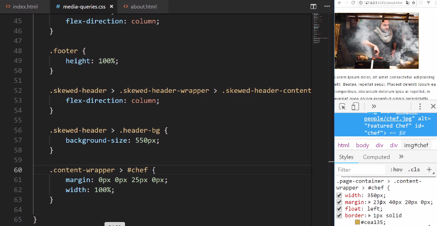
Moving down the line, let's now work on our image here. This is going to be the image that is, I believe, the id of #chef. This is going to give us an opportunity to learn about another skill in CSS.
I'm going to grab the content-wrapper and then I'm going to grab #chef. If I add some styles here, watch what happens. I'm going to add margin, in my ideal scenario I would have a little bit of margin on all sides, and it would just fit in nicely, but that would take up all the space.
So I'm going to use 0px 0px 25px, because I want some space on the bottom, then 0px. Then I want to have a width of 100%. Now if I hit save, nothing happens. Okay, so what gives here?
media-queries.css
.content-wrapper > #chef {
    margin: 0px 0px 25px 0px;
    width: 100%
}
Well, this is going to be a very good lesson because there's one skill that we have not talked about in this entire course. I purposely haven't because it can be considered a bad practice, but it is still something that is important to learn. I'll walk through exactly what it is right now.
Let's select this, and scroll up so you can see the values. If you look down into the tools here, you can see that we have a width of 350px. We have the margin, and these are the things that we set in our page-container class, in our CSS file.
This is an issue because it looks like it is ignoring our values. It's technically doing that for a very good reason, and this is the reason: do you notice how we have the page-container class and then the content-wrapper? This is following the rules of CSS.
There are two options that we could do. One, I could just come here and I could say .page-container > .content-wrapper > #chef just like this. You see how that worked?

That's perfectly fine, but I wanted to teach you another skill. Whenever you have a situation like that where maybe you weren't the one that created the styles, maybe you brought in some template or framework and you have these media queries, and you want to force your styles even when you have a less specific selector.
That's the entire reason why this isn't working, is because remember in CSS, the most specific selector wins the battle. You can always see what the most specific selector is by looking at the devtools right here.
We can either update it so that it matches the same level of specificity, or we can use a little tool here called !important. I can add a !important just like this in front of each of these values if I hit save, you can see that it still works.

Now, part of the reason why I did not teach this earlier is because using !important, is usually the sign of someone not understanding how CSS works. They don't understand how you need to have the most specific selector, in order to have priority with your style definitions.
There are times where this is helpful and is needed. I would not be doing my job if I did not teach it to you. This is the way that you can get that to work.
I also want to add some padding around the entire page. I'm going to close out of here, and I want padding on the side, not just of the image but of everything here on the page. That will make it easier to see and to read.
I'm just going to add a little bit of padding on the left, so we can do something like 21px on the left. Then we'll do the same thing on the bottom on the right.
media-queries.css
.page-container {
    padding-left: 21px;
    padding-right: 21px;
}
There we go. That cleaned it up nicely and this is making it much easier to read on a phone and see how it also moved it up. I'm really liking the way this is coming along.

Now with all of this, it is time to attack our squares. Now, this is going to be really cool. Now when I originally was building out the prototype, I was really excited with how this worked. We'll also use !important here just so you can see how it works.
I'll use a less specific selector. Just know that in your real-world applications, you usually just want to be area specific with your selectors so that you can always have control over what's going on. It's still good to practice and understand this process as well.
I'm going to grab just the square class just like this and let's add our grid-template-columns. Usually, we have been using, for our squares, we've been using 1fr, and 1fr. I want to just change it so now it's only going to be a single row. We can just say 1fr and !important once again.
media-queries.css
.square {
   grid-template-columns: 1fr !important;
}
Now if I hit save, you can see that automatically readjusted it. This is really cool how this works. So imagine that you've come to this site, and you're looking at the restaurant and then you have all of these cool, little, square rectangular types of images.

Now you may also notice that we kind of have a little bit of a bug here, where we have the image, then we have the heading and the content. That's followed by the image, or we want to follow it by the image, but instead, it's the heading again. This is not what we really want.
What we can do is we can force the order. So just like we changed the order of the elements in the navbar on the homepage, we can do the same thing with our squares. Let's go and verify what kind of classes we have here and what class names.
I believe it's img-wrapper, and then square-text-wrapper. That's what we're going to need to override here. So I'm going to say .square and then img-wrapper. I always want the img-wrapper to be second. I always want the img-wrapper to come afterward.
media-queries.css
.square > .img-wrapper {
   order: 2;
}
Then I want the text to be the first one. For this one, let's go, and I am horrible at remembering these names, .square-text-wrapper, square text wrapper. We want this one to have an order of 1.
media-queries.css
.square > .square-text-wrapper {
   order: 1;
}

.square > .img-wrapper {
   order: 2;
}
Now let's see if that fixed it. Now you're scrolling down, you see the text-wrapper here, then the image, then we have the text again, the image, and then the footer.

This looks really good, and look how cool that is. We didn't have to change any HTML or anything like that. We didn't have to use JavaScript or rearrange the items, we were able to do 100% of this, in this case, with CSS grid, and then just changing the order.
Let's move to the menu because this is going to be very similar. Let's open up the menu.html, and then from here, let's import our media queries. I'm going to import our media queries just like this, and you can see this automatically fixed everything.

Look at that. We have all of these just gorgeous images, and they're all in the right order. We didn't have to touch a single line of code on this page. That is pretty awesome.
Whenever you notice that you're writing code, that automatically takes care of other pages, that means that you're writing scalable code. You're writing code that you could use across an entire system. So that's working really well.
Lastly, we have our contact form. Let's finish this off and when we do we're going to have this entire course completed, which is pretty exciting. Let's open up the contact.html, and as you may have guessed, the very first step is going to be to import our media query style sheet.
contact.html
<link rel="stylesheet" href="styles/media-queries.css">
We bring in our media queries, and that takes care of the top. Now we have to fix what we have here in the form. So let's go down, and let's see a few of those names. We have the page-container, contact-grid-wrapper, and I think that's going to be the first one that we're going to address.
Let me close out our other HTML files, and now moving down, we have the contact-grid-wrapper. Let's adjust the width to 100%. Then we want to add the grid-template-columns so that it's just 1fr. Let's also add some grid-gap here and let's make that 10px.
media-queries.css
.contact-grid-wrapper {
    width: 100%;
    grid-template-columns: 1fr;
    grid-gap: 10px;
}
Hit save, and you can see that it is looking much better. We could adjust the image if we want to. It's completely up to you. I think it looks fine just like that.

Now we have to adjust this form. We just have to update these form elements because it is going too far to the side. We want it to end right here. We don't want it to go all the way past it. Let's see. We have the contact-grid-wrapper, now let's go and grab our form class.
We don't really need to work on the form class, we need to work on the input, and so with this, let's update the padding. I'll say padding should be 1.5rem on the top and bottom. Then we want 0rem on the left and right.
media-queries.css
.form input {
    padding: 1.5rem 0rem
}
You can see that, that worked perfectly. Now it's fitting in exactly where we want, and then we just have to do the same thing on the textarea.

So we're going to say textarea just like that, and for this padding, it's the same thing, 1.5rem, and 0rem. Hit save, and that's working. Then let's see if our animations are still working, everything there is looking really good.
media-queries.css
.form textarea {
    padding: 1.5rem 0rem
}
Wow, I'm excited. This site's looking great, and now that you know all of these skills, you're going to be able to build out any kind of website.

What we walk through, even though this may be a four-page website, the skills that we walk through, really are the fundamentals you need to build any kind of site out there.
You can use this to build a reporting dashboard for a business. You could use this for a marketing site, or a portfolio site. Anything that you want to build, you now know how to do. You know how to use tools like Flexbox, and CSS grid, just to be able to align anything on the page wherever you want. You know how to pull in images, and how to work with links, routing, icons, and custom fonts.
So congratulations in going through this. I know this is a very comprehensive course. You were able to do quite a bit of work, and hopefully, you enjoyed it. You got a lot out of it, and now you're going to be able to go out and build your very own projects.