- Read Tutorial
- Watch Guide Video
- Complete the Exercise
Let's start back in our form.css. We have the form input, and so what I want to do next is I just want to grab that textarea.
form.css
.form textarea {

}
You may notice that here we did not select the textarea like have normally gone through this, and that's because we don't want just the initial child elements since we'd have to say .form > .form-group > textarea.
But here in this situation we just want to have all of the text area tags inside any form.
form.css
.form textarea {
    margin-top: 20px;
    width: 100%;
    height: 250px;
    border-radius: 3px;
    border: 3px solid #11122b;
    font-size: 1.5rem;
    font-family: inherit;
    color: inherit;
    padding: 1.5rem 2rem;
    transition: all 0.3s;
}
Hit save. Come back. And if we hit refresh you can see we have a much better-looking textarea.

I think this looks a million times better than the default one. So that is coming along quite nicely. So I think the next area that makes sense to work on is going to be the button.
And now we could put the button here in the form.css, but my personal preference whenever working with buttons, just based on my experience, is many times buttons are going to be used throughout an entire site. So I think they are worthy of their own dedicated style page.
So I'm going to say buttons.css, because usually, you're going to have multiple buttons. We're only going to have one. Then let's go to contact.html and let's just make sure that we have imported this.

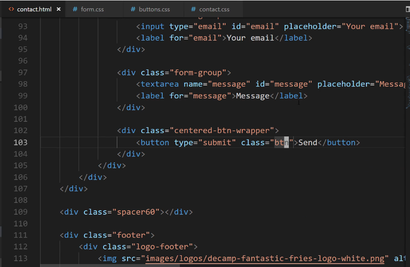
There we go. So here we have a button of type submit. Let's add a class to this. Now if we go into buttons, I can add a dedicated button class.
buttons.css
.btn {
    background-color: #cea135;
    color: #11122b;
    font-size: 1.25em;
    padding: 10px 25px;
    border: 1px solid #cea135;
    border-radius: 2px;
    outline: none;
    transition: all 0.3s;
}
Now we added a border but you won't actually see the border visually because we're going to use the same exact gold color.
The reason why I'm doing this is that in certain browsers if you do not put a border around the button, certain browsers will automatically do that actually, and it makes the button kind of look ugly.
So the best practice is to either put a different colored border or to simply put a one-pixel border with the same color that you're wanting.
Later on we're going to add a very cool little animation where we add in a fade in and out with a box shadow whenever we click on the button, which is something that will work really well on mobile and on web, and it's something that's pretty popular right now from a design perspective.
Hit save now and let's make sure that worked.

There we go. Now we have a much better-looking button. We've built out the styles for our textarea message, and then for our button. In the next guide, we are going to go back up and we're going to start adding styles for our labels.