- Read Tutorial
- Watch Guide Video
Right now it's too short, and we need it to be wider like we have in our design.

We can do this the same way that we did the logo earlier. We took the logo and we built a display grid.
main.scss
.logo-main {
    display: grid;
    justify-items: center;
}
Now, it does nothing but when we get rid of justify-items: center; on the home wrapper, you'll see it stays centered, but nothing else does.
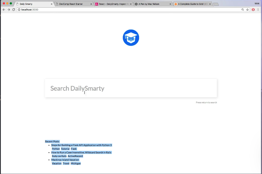
You also see that the elements are now wider. Let's put justify-items: center; back in the home wrapper, What we can do is instead of justify-items: center;, we could use justify-items: stretch;.
main.scss
.home {
    height: 100vh;
    width: 66vw;
    display: grid;
    align-content: space-around;
    justify-items: stretch;
    // grid-template-rows: 1fr 2fr 1fr;
}
Now, we'll still need to center our logo, so we'll leave the logo-main styles in. We also need to add some recent posts styling, so let's just add it to the logo styles.
main.scss
.logo-main,
.recent-posts {
    display: grid;
    justify-items: center;
}

That's how we can fix the width. Let's go ahead and hop into the next guide, where we will get into the recent posts.
git status
git add .
git commit -m "fixed some grid styles"
See you in the next video.